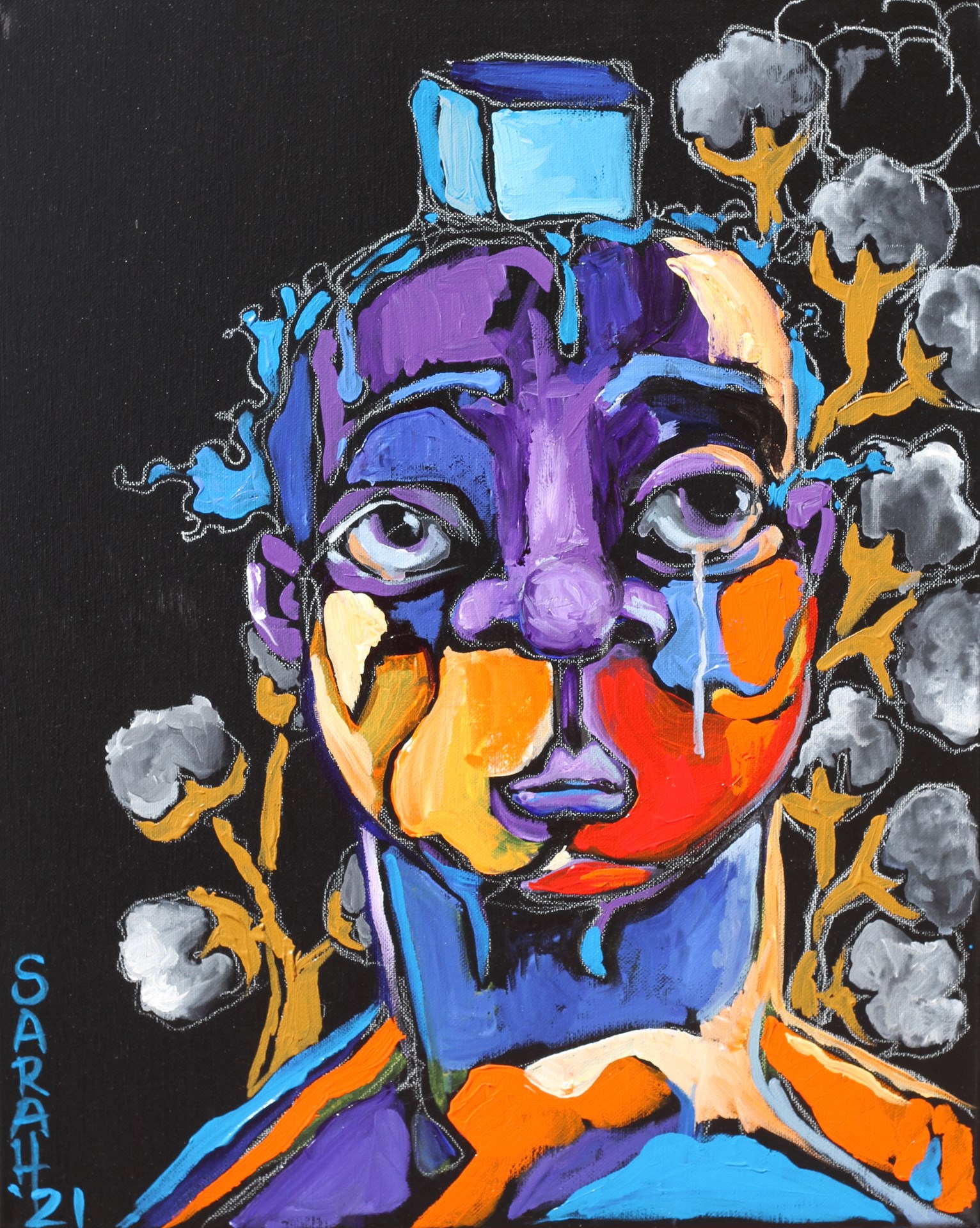
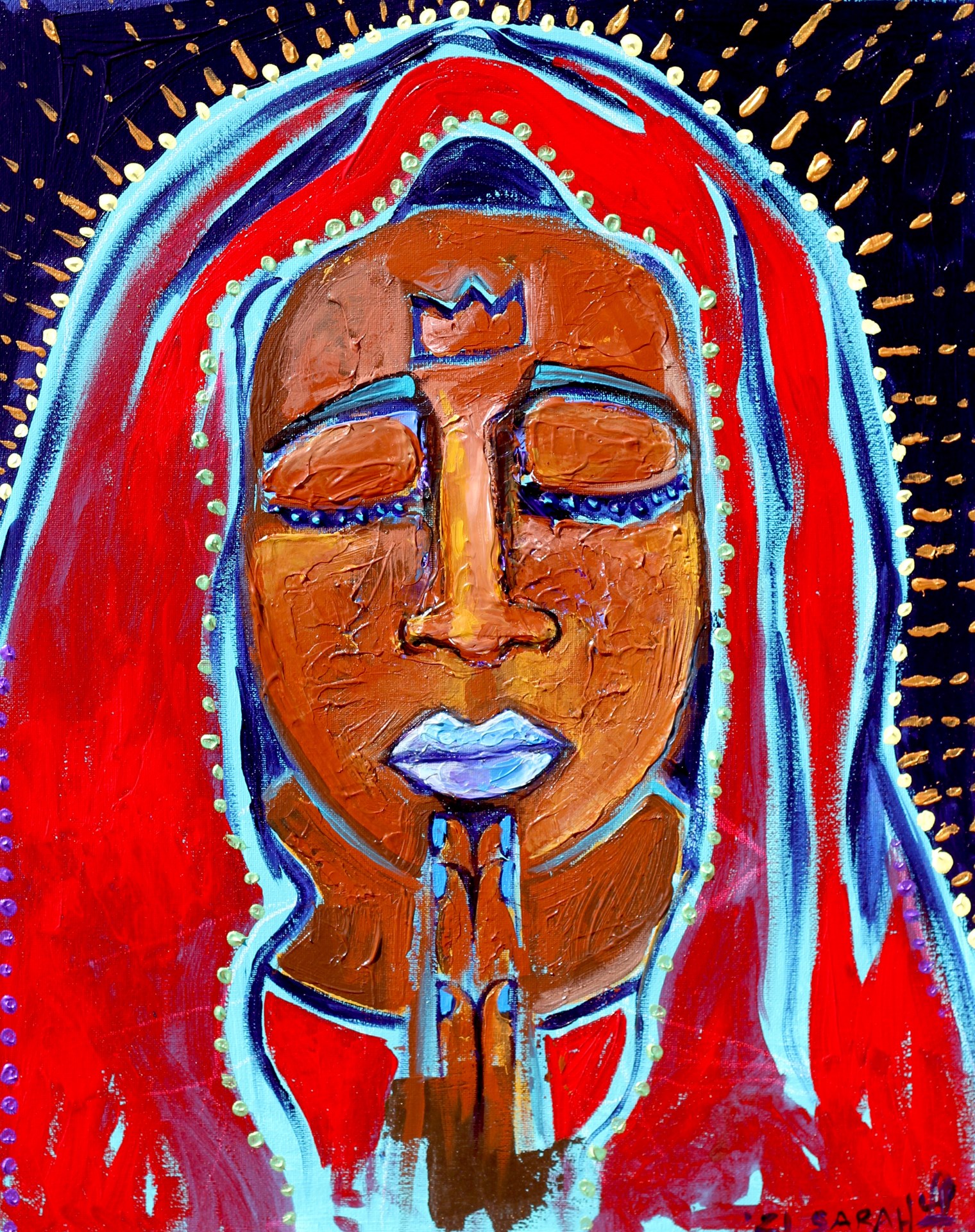
From top left: “Not for Sale,” “A Kiki in the Cabins,” “Memories of a Freedom March,” “A Hot Day in the Cotton Field Mind over Body,” “BLACK MADONNA”
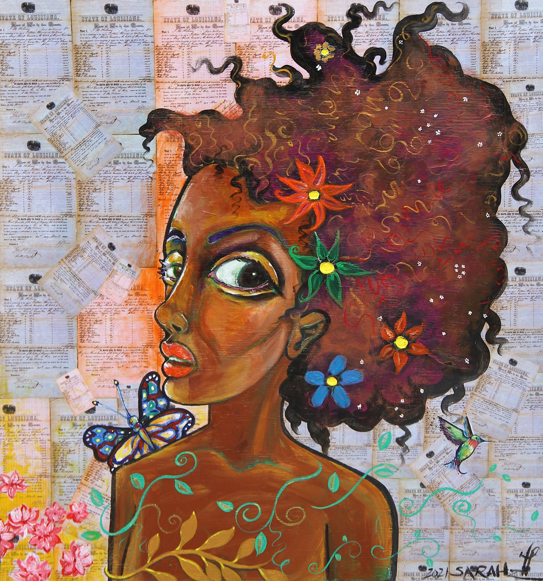
Sarah Louise Wilson is an artist based in California. She writes, directs, produces, paints, and acts. Her courage puts her on an edge that cannot be fabricated; rather, it comes as a natural part of who she is and what she stands for.
In 2010, with her company Stella Bella Productions, she penned and starred in her pseudo-autobiographical romantic comedy “Jelly,” starring Natasha Lyonne (Orange Is the New Black) and Hollywood icon Ed McMahon. The script alone attracted name talent and funded the film into release. After screening in competition at several renowned film festivals, the film went on to win four Accolade awards and is represented by Cinetic Media. It has since been released on Netflix, Fancast, Hulu, PBS, and The Sundance Channel.
Throughout her career, Sarah wrote and directed short films, plays, music videos, documentaries— Anything she could get her hand on. In early 2016, when Sarah was living in Almaty, Kazakhstan, she shot her feature film No Exit entirely on location. The movie went on to win multiple awards and was written up by Esquire, Good Housekeeping, and Variety. To learn more, visit her website.
We’re also very excited to share an interview that dives deeper into Sarah Louise Wilson’s art. This interview was conducted via email by our Art Editor, Khanh Nguyen.
Khanh Nguyen: What is the difference between how you tell a story in your paintings versus in your films?
Sarah Louise Wilson: In films, you have millions of pictures to tell a story but in painting, you only have one.
KN: What kinds of stories do you like to tell? What is the importance of telling those stories?
SLW: I like to tell stories about hope because the world is bleak enough.
KN: How has painting influenced your film-making and vice versa?
SLW: Painting teaches me to be visually concise in filmmaking. Filmmaking helps me to understand light.
KN: Some of your work, like “She is Palestine,” features subjects outside of the United States. You also worked in Kazakhstan for a while and held an exhibition there in 2015. What interests you and inspires you about non-American subjects?
SLW: I’m interested in understanding the human condition as much as possible.
KN: Much of your art focuses on honoring past and current African American icons and social justice leaders. What does this work mean to you personally, and how do you think this work affects the fight for social justice?
SLW: Some of my work, as of late, does honor past and current African American icons because I find their point of view to be exciting and enlightening. I do not think my work alone affects the fight for social justice. I believe the collective work of artists expressing like-minded issues that need a spotlight, can affect the fight for social justice.
KN: What does your work space look like?
SLW: Messy when working. Clean when not because I like to make a mess.
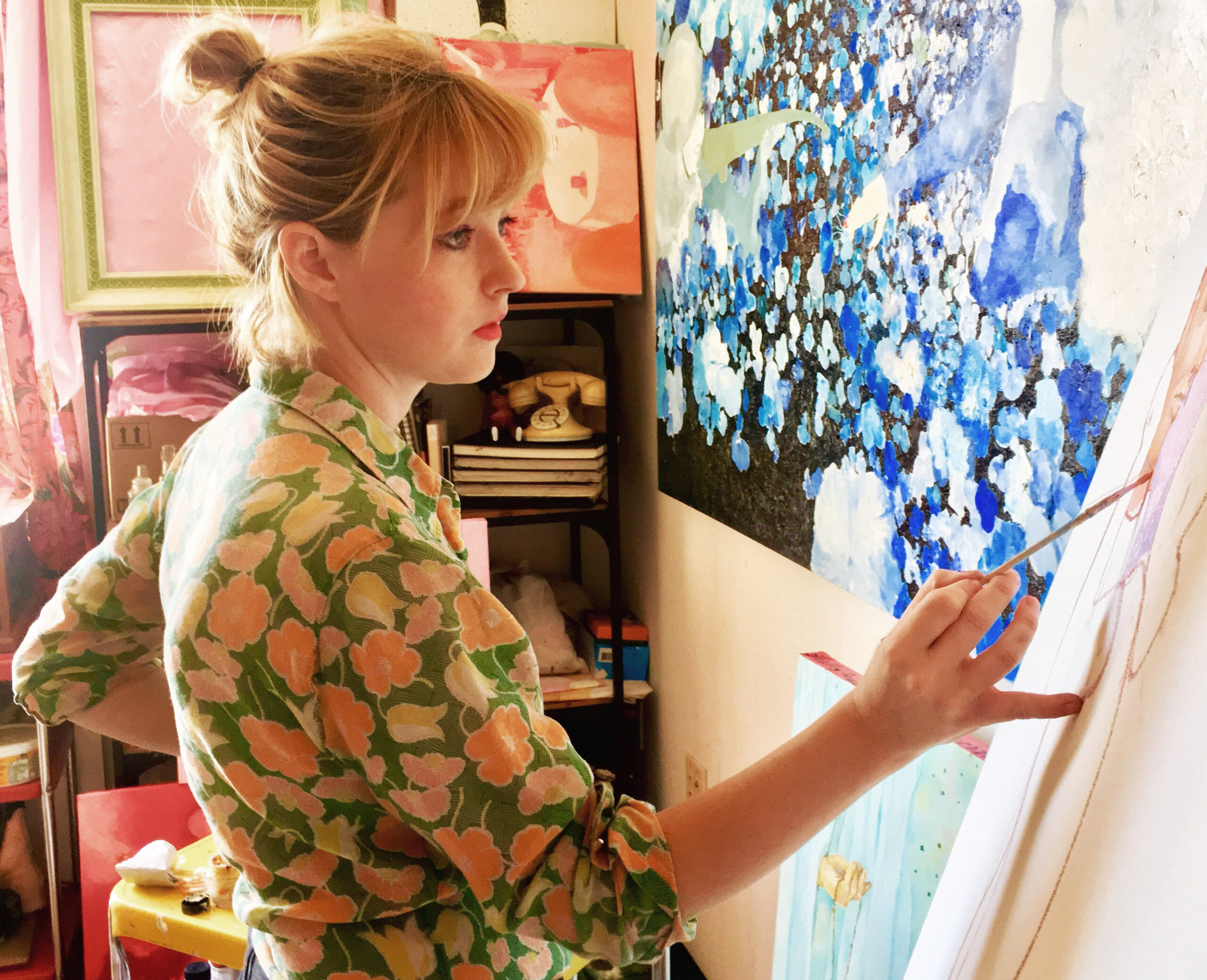
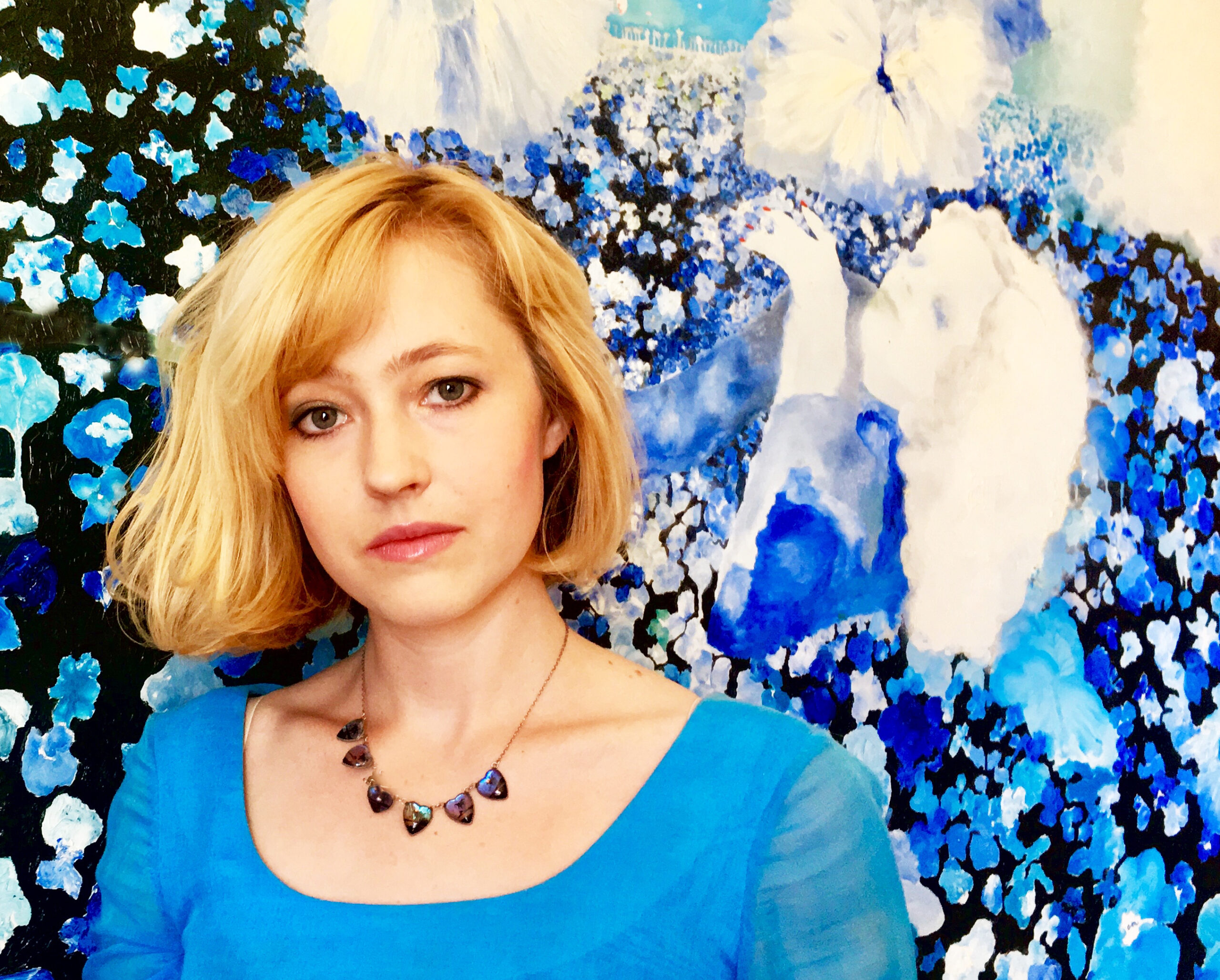
Allison Moyers is an oil painter and video artist from Texas who currently lives and works in Phoenix Arizona. She traveled Europe and lived in France for five years where she received her bachelor’s degree in Fine Arts from ESAD de Valenciennes in 2015. Her work explores the subjects of stardom, vanity, and excess within society with an emphasis on woman and the feminine. She is fascinated by western culture’s obsession with beauty in film, literature, and classic painting that have created idealized versions of reality. The stylized and romanticized art are indispensable elements in her work and correspond to the methodic use of color that expresses human emotions through their psychological representation.
In this post, we feature a short film made by Allison as she tours her art and answers questions from our Issue 28 Art Editor, Khanh Nguyen.
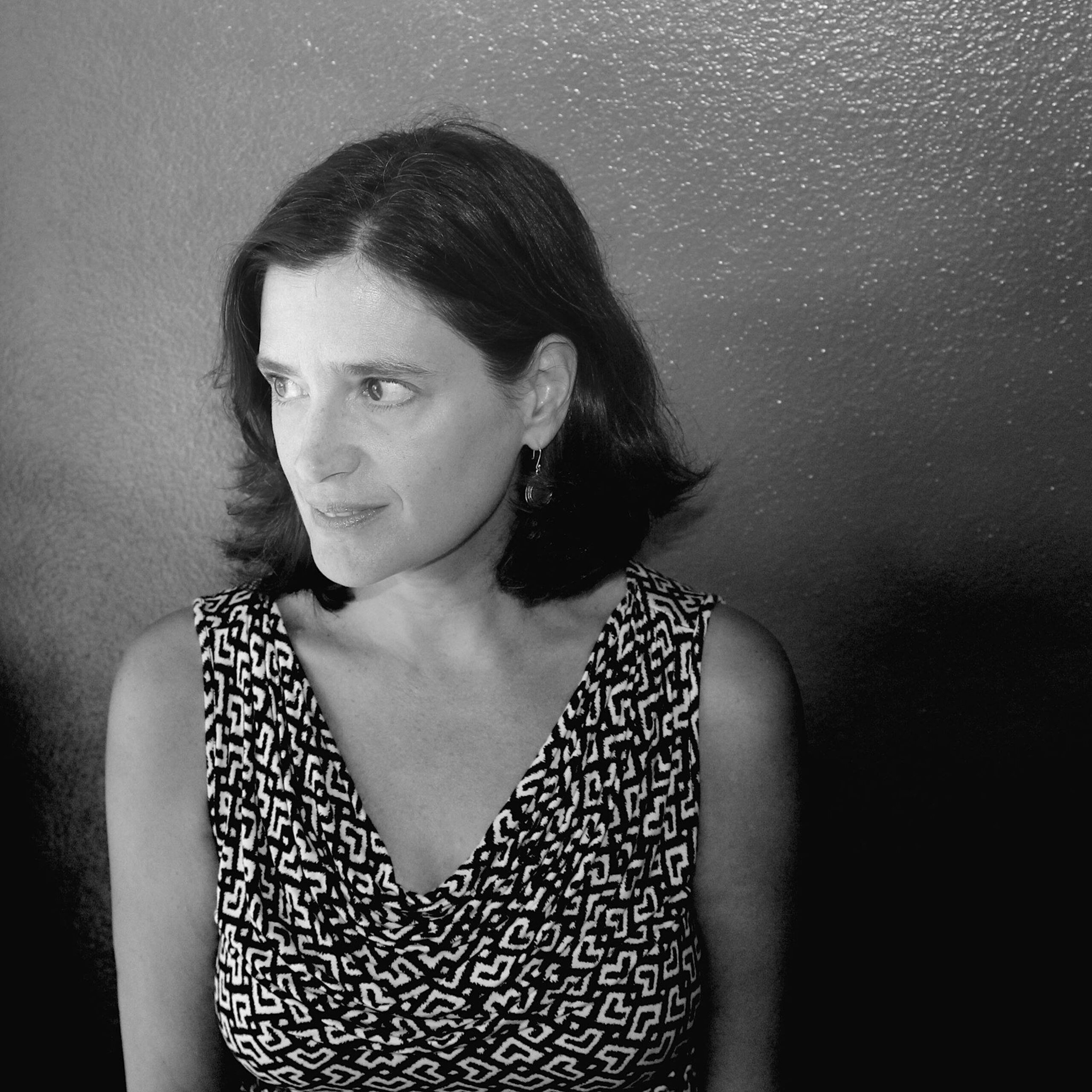
Carolyn Guinzio is the author of seven collections. Her new collection A VERTIGO BOOK (The Word Works, 2021) was the 2020 winner of the Tenth Gate Prize. Her work has appeared in Poetry, The Nation, The New Yorker and many other journals. She lives in Fayetteville, AR. Visit her website to learn more.
Our Issue 28 Art Editor, Khanh Nguyen, wrote a few interview questions for Carolyn and this is her lovely response:
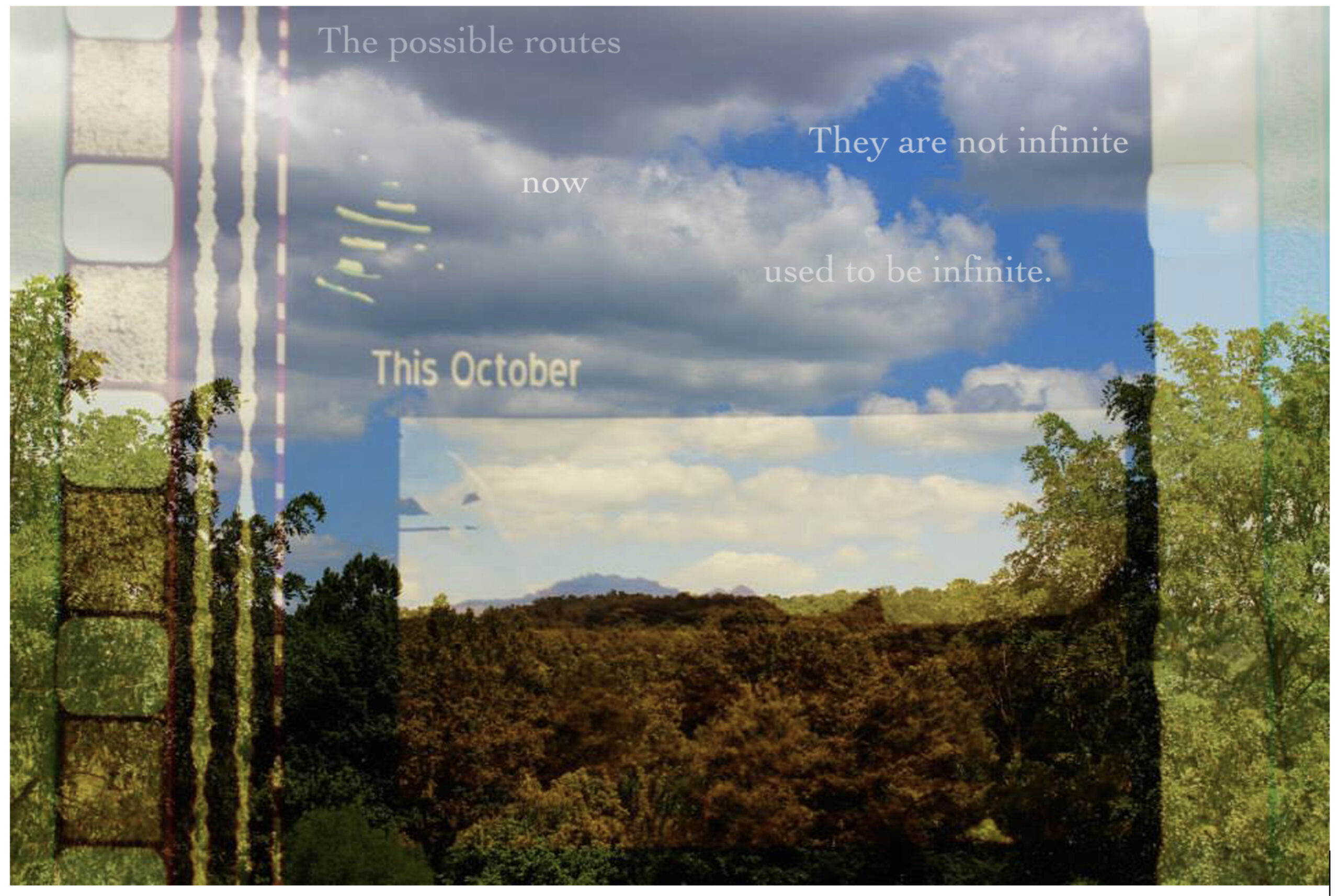
Carolyn Guinzio: I have found that I can reach places with visual poetry that I could not get to with text alone. It started somewhat accidentally, when I was with my son in a second hand store in Fayetteville, Arkansas, where we live and where he has grown up. Covered in dust in a corner we found a film reel. It was unwrapped, and it had no price on it. We held it to the light and realized it was a trailer for the movie Elizabethtown, which takes place and was shot in the town where my son was born. The strangeness of inexplicably finding it there was inspiring. We knew we could make something from it. I layered macro-photos of frames from the trailer over photographs of our current environs: our road, the hills, the windows of our house— and then layered micro-poems primarily about my son: his birth, his earliest years (we lived in Kentucky the first 18 months of his life). My hope was to get at something about time, memory, place, and loss. We lived on the eastern edge of the Central time zone, so we had to cross into Eastern time to get to the hospital: something I always found peculiar and a little disorienting. What time was my son born? How do places impact our sense of our own identities? Something about the layering of images with these ideas I felt helped me examine a complicated pursuit in a way that was more evocative and subtle than I was capable of through just text.
I was a total convert after that, particularly since place is so important to me in my work. The next thing I tried was about the experience of revisiting old haunts on Google Earth. There’s nothing like it to make one realize how limiting a virtual visit can be. I love these technologies, and having access to them is what makes so much of what I try to do possible, and yet, and yet— looking at an image of the street where I grew up does not feel like standing on the street where I grew up. A combination of media might get me closer to what fragments of memory actually feel like.
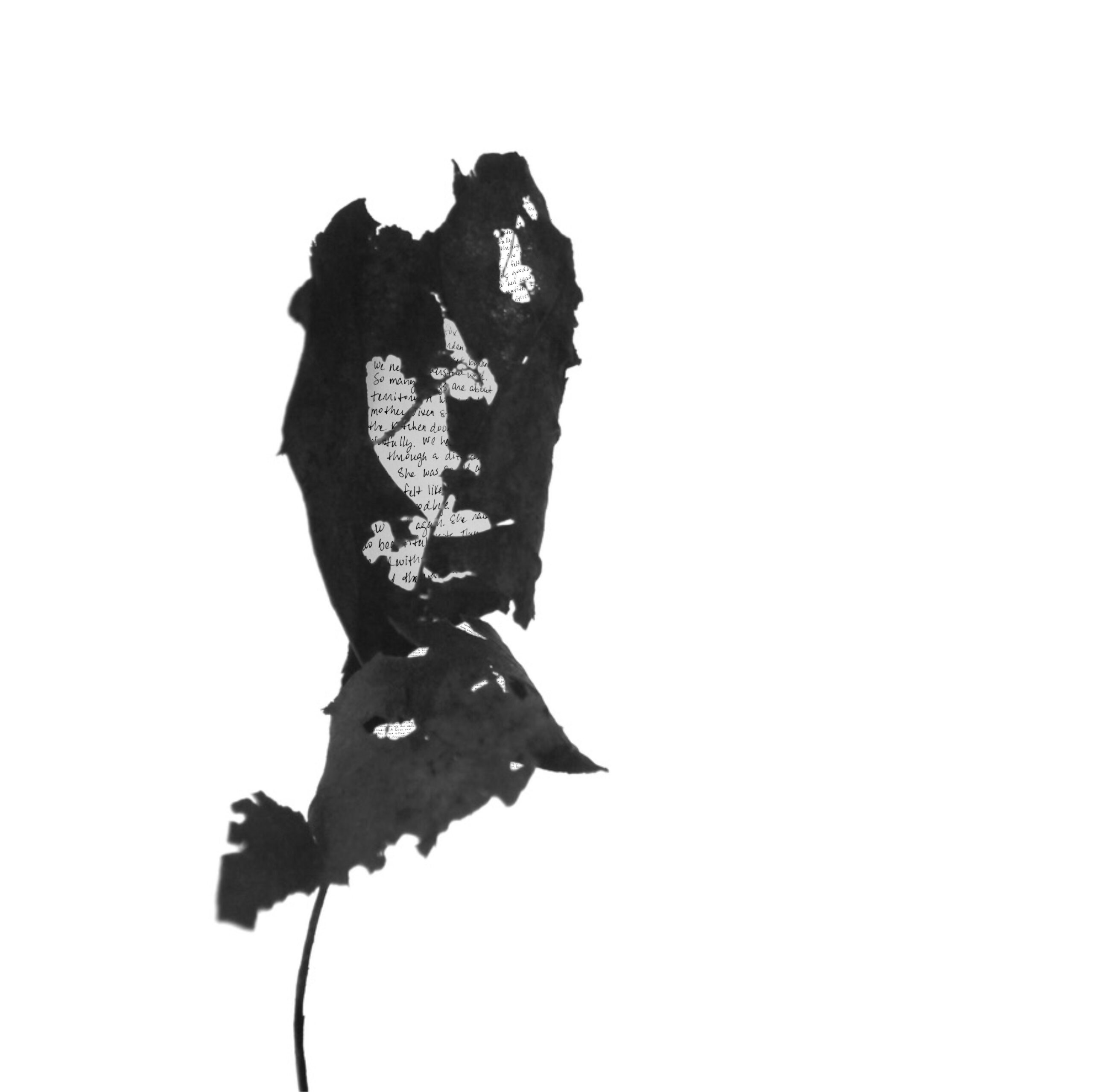
“Fox” (LEAF)
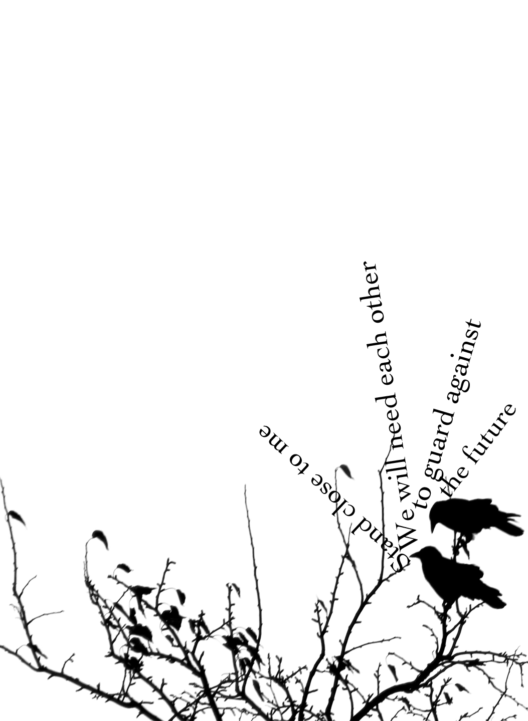
Often, a fleeting image or concept will pop into my head, and I’ll wonder: can I make that happen? The project Ozark Crows, which was excerpted here at Superstition Review, began with a single image in my mind, of two crows in the sky holding a ribbon of text between them in their beaks. The sky and trees around my home are filled with an extended family of crows, and I was already somewhat obsessed with them— their intelligence, their way of interacting with each other, ranging from the irritable to the tender. They interacted with us, too, leaving a piece of glass in the spot where we tossed out some stale cornbread, for instance. By then, I’d read so many books about crows that I was able to understand a lot of what I was observing, and this gave me so many ideas for the pieces in the book. It was incredibly difficult, and I don’t think I ever had more fun on a project. That Spuyten-Duyvil Press was able to make it into a book, and such a lovely one at that, is something I’ll always be so grateful for.
Because of my interest in place, most of the images I use are taken in places of personal significance, primarily where I live: the ground, water and sky where I’ve spent the last twenty years with my family, in the Ozark Mountains just outside Fayetteville. I think I’ve documented it to within a square inch of its life!
“The Fall” (OZARK CROWS, Spuyten-Duyvil, 2018)
The project I’m currently finishing began the same way: with an image that appeared to me, and that I wondered if I could make. I love skeletonized, disintegrating leaves— I find them almost more beautiful than perfect, supple leaves. They themselves are like poems to me, a poignant memento mori. We are all trying to make something lasting and meaningful, something that can reach across time, and when I pick up a leaf with a beautiful pattern chewed into it by some infinitesimal worm, when I hold it to the sky and make a macro-photo of a tiny fragment of it, I feel like I’m participating in, acknowledging, a meaningful continuum. What if a fragment of a poem was visible through these holes? What if it was handwritten? Because I make things digitally, I want to mitigate the coldness of that form. I thought that the intimacy of the handwritten word— evidence of a human hand— coupled with the fact that the text in these pieces is so small that one has to lean in closely to glean even a fragment of meaning, I might succeed in making something that had a sense of warmth and life despite being created digitally. I am drawn to the idea that something as small as a hole in a leaf can contain a universe, or at least a poem. I’m also hopeful that, despite the crush of data we all experience, the isolation of the last year, the divisions and alienation, we can still reach other somehow.
“Your Current Location” (ELIZABETHTOWN, How Much of What Falls Will Be Left When it Gets to the Ground?, Tolsun Books, 2018)
All of this is not to say that I don’t also love writing. My newest collection, A Vertigo Book, is made entirely of words, and in fact, much of it was written during a period when taking photographs was difficult because I was suffering from a particularly terrible bout of vertigo. The words, the very shape of letters, felt like a way to hold onto the earth and keep it still, almost like bird feet clinging to a wire. And it’s probably no accident that, after months of looking up to photograph crows, the LEAF project requires me to, instead, keep my eyes on the ground.
If I have to narrow down my editorial preferences, there are two things that make an artwork especially attractive: story and process. As I’ve written in my editor’s note for Issue 28, you can perceive an art piece’s story in a single glance. Sometimes, the story changes or grows the longer you look at it. Oftentimes, the story you see is different from what someone else sees.
I chose the artworks for Issue 28 in hopes that readers will have a fun time exploring the stories each piece tells, and maybe even learn something new from the message each piece conveys. Take our cover artist, Jeff Rivers, for example. The subjects of his art have featureless faces, yet their clothing contains meaningful patterns and the positioning of their bodies exude emotions. Even without knowing Rivers’s inspiration for this collection – Tony Morrison’s Beloved – you can feel the poignant account of Southern life in each piece. Or take Kateryna Bortsova’s acrylic paintings, spread across maps of Spain, Germany, and Jordan. Might the powerful expressions of the male subjects reflect each location’s history? Or a facet of each location’s personality?
Having been acquainted with artists my entire life, and having created art myself, I know the direction of an artwork is formed not just in the first idea but also during the process of creating. When artists pick up their tools, touch their canvas, and play with their composition, they discover new relationships between colors, shapes, textures and other art elements. What gets shared with the world is this personal and oftentimes vulnerable process. I feel this in pieces like Teresa Sites’s colorful collages. There is time-consuming sincerity in the arrangement of each cut of paper, a sincerity that better communicates her theme of movement and music.
My time as an art editor was very fun personally, but I always thought about how readers of Superstition Review might experience the art I select. Whether it is a new story or the process of creating art, or just a relaxing moment, I hope our audience will experience something worthwhile in the work of the artists I have shared with them.