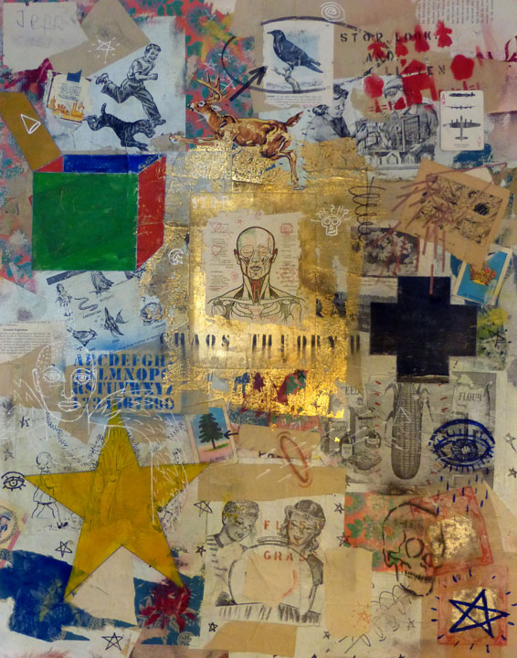
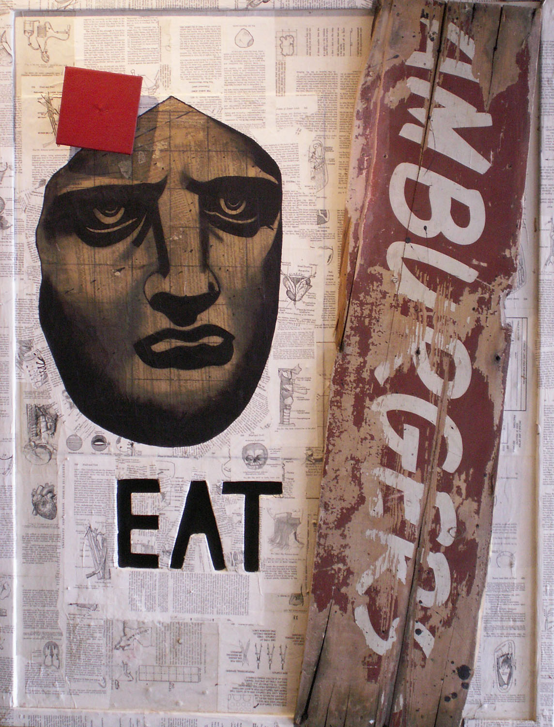
During AWP 2013, Superstition Review had the pleasure of meeting a small press called BatCat Press. They publish soft cover, but mostly hardcover works of poetry, fiction, creative nonfiction, and mixed media. However, they welcome all genres and encourage authors of all ages to submit work. What’s unique about BatCat is that they hand-bind all of their publications. You can view their process here. They have published a wide variety of authors some of whom are graphic artists, teachers, and award-winning authors including Kevin Haworth who I had the opportunity to interview about his experience with BatCat Press and his essay collection they published, Far Out All My Life.
Mai-Quyen Nguyen: What drove you to submit Far Out All My Life to BatCat Press?
Kevin Haworth: This is kind of embarrassing, but when I was three years old I had a gray striped kitten that I named Batcat. I had a photo of him that was taped inside my metal lunchbox and I looked at it while I ate lunch each day at preschool. (I was kind of a lonely child.) He grew up to be a very loyal, if not terribly clever, cat and lived a wonderful life until a truck backed over him in our driveway. Really! So when I saw the name BatCat Press it grabbed my attention, and the more I learned about the press the more intrigued I was. I loved the idea of a small press operating out of a charter performing arts school. I have a colleague who grew up in Midland, where the school is located, and all his stories about the town paint it as pretty grim. When I ultimately visited the BatCat students, once my collection of essays had been accepted, I found the town to be as low-rent as advertised, and the school all the more amazing for it. It’s a remarkable place, full of life and creativity.
MQN: Can you describe the publication process with BatCat Press? How did you decide on the cover of your essay collection?
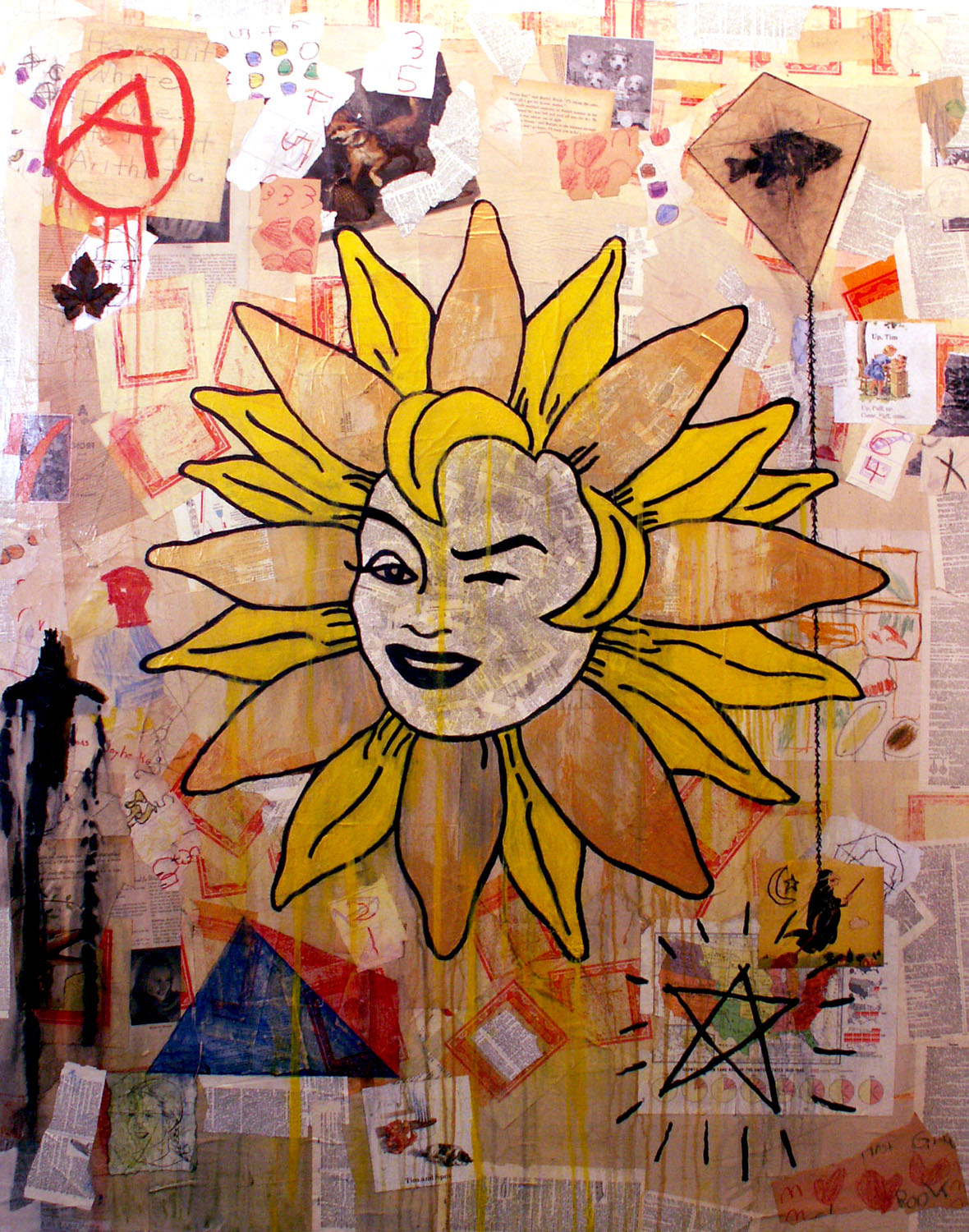
KH: First of all, Deanna Mulye and the students designed the cover. They designed everything about the physical look of the book, and it’s quite an accomplishment. The whole book is assembled by hand, so no two covers are exactly alike. I met the student whose hand served as the handprint for the cover (she held up her hand for a high-five) and I saw photos of the assembly process. It looked like the world’s most fantastic sweatshop—all these students in a row, putting the parts together.
The publication process was a joy. I worked with a student named Maria Capelli, who was the lead editor on my book. She’s in college now. We tossed some ideas back and forth about the order of the essays, and there were a couple of minor adjustments that we made to the text to be sensitive to the fact that the book is published by a high school. But there’s a lot of stuff in it that others might consider controversial in that setting—a whole essay, in fairly graphic terms, about a newborn’s circumcision, for example—and they welcomed all of that. They’re a very mature and sophisticated group of students.
MQN: I rather enjoy that they bind all of their publications by hand, and I understand now that they designed everything physically. My question is, then, did you give any input on the cover through the process? How involved were you in what the cover looked like? I’ve read that major publishing companies can sometimes disregard the author’s comments on their covers.
KH: Regarding your question about the cover: While publishers often consult their authors about the covers, in this case, I knew that BatCat Press brought a sense of innovation and beauty to their cover designs and that the cover was an integral part of the book’s overall design. So I left it in their hands, and they did a wonderful job.
MQN: What drew you to the form of innovative, experimental nonfiction for this collection of essays?
KH: I had been reading a lot of innovative nonfiction over the years, books like Maggie Nelson’s Bluets and Eliot Weinberger’s An Elemental Thing. I was really drawn to the way that these authors mixed different kinds of material—sometimes personal, sometimes scholarly, sometimes historical—and the way they put them next to each other, without apology. Writing about a Jewish life, as many of these essays do, is a deep process. Jewish history looms large, as does the many forms of Jewish observance. I wanted a style of writing that reached beyond just my own life and recognized all these different forces that work upon us everyday, layers of history, geography, identity. So this is my attempt to bring all those elements into the essays all at once.
MQN: How long did it take you to write this collection?
KH: About three years. I started submitting the individual essays to literary journals and there was a lot of enthusiasm for them—they’ve appeared in journals such as Witness, Fourth Genre, Harpur Palate, Copper Nickel—really wonderful journals to be in. Once I realized that I had a critical mass of essays with enough links between them, about four or five, I started writing with a little more intention toward making a book. I received a ten-week residency to Headlands Center for the Arts, near San Francisco, and I did a lot of work there to write some of the longer essays and to knit the book together.
MQN: What do you like best about BatCat Press?
KH: There’s a lot to like about BatCat. They have creative, dedicated teachers, led by Deanna. They have a bright-eyed enthusiasm. They believe in art. I want my children to grow up to be just like little BatCats.
Staffed and operated by Deanna Mulye and the students of Lincoln Park Performing Arts Charter School in Midland, PA, BatCat Press seek to publish two new titles every year, accepting submissions of complete manuscripts, which include collections of short pieces, novels, novellas, poems, and stories. In addition to Kevin, I had the chance to interview Deanna about BatCat.
Mai-Quyen Nguyen: When, why, and by whom was BatCat Press established?
Deanna Mulye: BatCat was founded in 2009, and it began as a class at Lincoln Park Peforming Arts Charter High School, where I was teaching bookbinding classes as an elective option for students in the literary arts program. There was a great deal of interest in these classes, so much so that we (program director Dan LeRoy and myself) decided that we wanted to find a way for students to parlay both their creative writing and bookbinding skills on a larger scale. Establishing a small press for the students to run seemed like the natural direction, and so we pitched the idea to the students and off it went. In the beginning it was a huge experiment, as none of us had any experience with small presses or behind-the-scenes of publishing, but we found our footing very quickly. There is a lot more to the story, of course, but I think I’ll stop it here.
BatCat meets as a class three times a week during the school year (and very frequently after school during certain times of the year). The staff changes yearly as students graduate, and I am the “teacher” or “managing editor,” depending on the context. All students who are on staff are required to have taken classes in poetry, fiction, creative nonfiction, screenwriting, critical reading, and bookbinding (they are usually upperclassmen, but occasionally sophomores qualify).
MQN: What inspired you to hand-bind all of your publications?
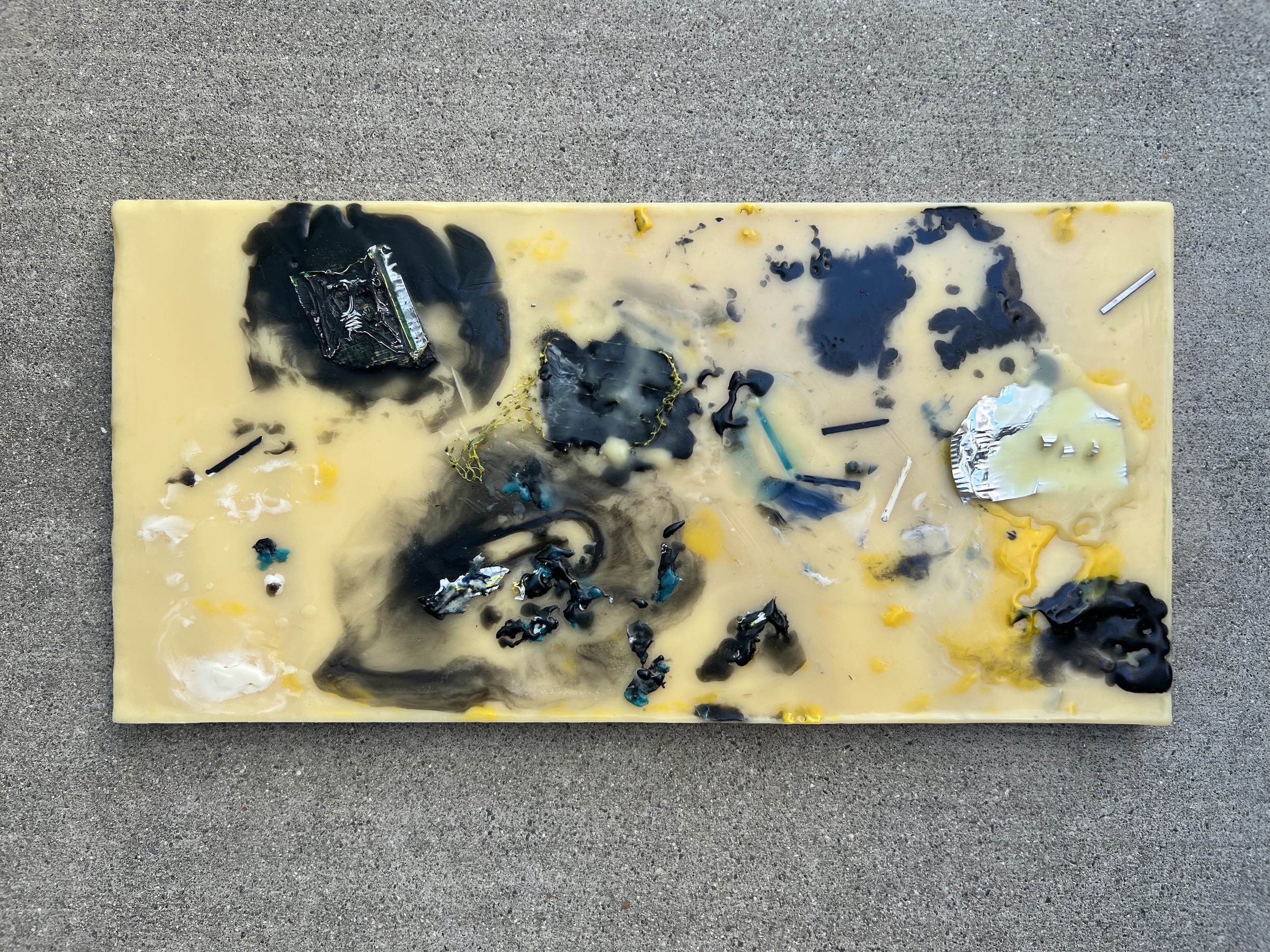
DM: I guess this was kind of addressed in my last answer – it’s not so much an inspiration to do so as it is an impulse and a shared interest among the staff members. We love the freedom that making books by hand gives us in terms of design. We want to produce books that aren’t just for reading, but for experiencing, and hand-binding has allowed us to do some pretty unique things with the physical structure that would be hard to achieve otherwise.
MQN: Can you briefly describe the bookbinding process?
DM: When we select a manuscript for publication and head into the process of book design, we ask the question, “What is the best way this work could possibly be presented? What is its ideal physical form?” and go from there. Size and binding style is usually our starting point, and from there we move on to structure, layout, and then cover design. We usually make a number of mock-ups, trying out different design ideas and to test materials, which we keep doing till we have what we want.
Once we know what the final design is and what materials we are using, we make the books assembly line style. The actual process for making each book can vary wildly from title to title, but it always involves a lot of cutting, folding, sewing, and gluing. Last year we also spent a lot of time painting, as the covers for both Far Out All My Life and Snowmen Losing Weight are all individually colored/specked. We’ll be doing something similar for this year’s projects as well.
MQN: Do you collaborate with the author on his/her book cover?
DM: Not usually, only when an author expresses interest in doing so, and even then we reserve final design approval.
MQN: What is the origin of the name BatCat Press?
DM: When the idea for a small press was being floated, our department was located in the basement of a (very old) library that had a door that led directly outside. It was a unique space, but also led to some weird interactions. That spring we were making handmade paper for the school’s literary journal and the door was left ajar – and we had visitors. One day we discovered a bat (he was hanging out next to a blender full of paper pulp) and a few days later, two kittens wandered over and spent the day with us (and that was one of the best days EVER, of course).
A week or so later we were brainstorming for press names and we got to that point in the process where everyone was just pointing at things and tacking “Press” onto the end. Someone suggested BatCat, and it just seemed right, so we went with it.
MQN: Aside from your handmade covers and books, what sets you apart from other magazines?
DM: We’re not afraid of work that doesn’t fall into a conventional category, and we’re not hyper-focused on any single style or genre. The staff changes every year and so do their preferences, so we leave our submissions guidelines wide open and read everything, looking for what feels right. This might not be particularly helpful for those looking for cues on what to submit to us, but I think the advantage for our authors is that we are extremely invested in the material and will go to great lengths to “do it right.”
Additionally, we look for work that we think will be of interest to a broad audience, not just other writers, which is how I sometimes feel about other journals/presses. Since we’re housed in a high school, we want our books to not only be of a very high literary quality, but also accessible to our most immediate audience: students studying other disciplines, their friends, and their families (and, of course, our alumni, many of whom have gone on to study writing at the college level).
MQN: I can see that a great deal of time and effort goes into publishing two original titles. What are some of your brief and long-term goals as a small press?
DM: Our perpetual goal is to give the students a great experience. It’s a lot of hard work and being on staff can be extremely demanding, but ultimately the press was created to give students the chance to do what they want to do and what they think is right, which is something I try to keep in the back of my mind at all times.
One of our brief goals is to publish some fiction! So far we just haven’t found the right piece or collection, but every year it’s come up as something we’d like to see happen. Maybe next year. For the long term, as long as there is student interest in the press, we will continue to exist – hopefully for a long time. Every year we’ve received more submissions and made more sales, and hopefully this trend continues.
MQN: You have a section called Collaborations on your Publications page—with whom have you collaborated?
DM: The website really needs some revision… this section was created years ago when we thought we’d be doing more outside collaboration, but it has not yet come to pass, although it’s still not out of the question!
Follow BatCat Press on Facebook and Twitter, and peruse their website at www.batcatpress.com. You may find yourself wanting one of their handmade journals or sketchbooks.
You can also purchase Kevin Haworth’s collection of essays, and other works BatCat has published, at their online store.

 Royse Contemporary is proud to present the solo exhibition of Angel Cabrales entitled NGC 4594 (The Sombrero Galaxy). The title refers to the actual spiral galaxy located in the constellation Virgo with a bright nucleus, an unusually large central bulge, and a prominent dust lane in its inclined disk, which gives it the appearance of a sombrero.
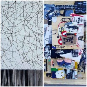 Royse Contemporary is so excited to present “Expression & Dialogue,”
  Royse Contemporary is so excited to present “The Sound of Color” by